Influence sensitivity plots
Use the plot_influence_sensitivity() function to create a SHAP dependence scatter plot to visualize the relationship between feature values and their SHAP values.
This can help you understand how changes in feature values influence model predictions.
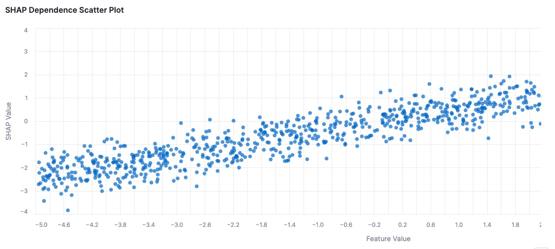
In the preceding example, the plot shows how the feature values influence the model’s prediction.
Required arguments
| Argument | Description |
|---|---|
shap_values | A pandas Series or 2D array containing the SHAP values for the same feature |
feature_values | A pandas Series or 2D array containing the feature values for a specific feature |
Optional arguments
| Argument | Description |
|---|---|
figsize | A tuple of (width, height) that controls the size of the plot. Uses a default size of (1400, 500) if not specified. |
Note
The feature of providing a 2D array of SHAP values and feature values is only available in Snowflake Notebooks. To select the feature for which you want to visualize the SHAP values, you can use the provided interactive dropdown selector. If you are using a local notebook, you must pass a single feature’s SHAP values and feature values as arguments.
The function returns a chart that visualizes the feature values along the x-axis and their corresponding SHAP values along the y-axis.
The visualization can be helpful to understand the following data points:
- Trends in how feature values influence predictions
- The strength and direction of influence for each feature
- Clusters or patterns in feature interactions